Dear Moderator,
My research and planning work can be found
under the label 'AS Research and Planning' on the right hand side of the page. I
hope you like it!
[This blog is now closed.]
Sunday, 25 March 2018
Friday, 23 March 2018
12. My final production
Here are my final four adverts.
 |
| Advert 1 - Basketball |
 |
| Advert 2 - Running |
 |
| Advert 3 - Badminton |
 |
| Advert 4 - Skateboarding |
Wednesday, 21 March 2018
11. Production Review: My production and my intended improvements
During production of my advert, I asked several people to give constructive criticism so that I might improve any aspects of my advert that they thought needed attention. This included reviews from both media studies teachers, Mrs Blackborow and Mrs Dymioti, who both looked at the adverts from a layout and design perspective, as well as a review from Sam Burton, the media technician, who looked at more technical aspects such as colour grading.
7/3/18: Mrs Blackborow review
Mrs Blackborow noted that the black box on which the branding was located was too much of a jarring transition from the rest of the advert, and that it completely cut off the image. To rectify this, I changed the box so that it was transparent and gave it softer edges. This eased its transition from the focal image and made sure it didn't completely obscure what was behind it.
I was also recommended to remove the transparent box behind the film quote - I had added it to improve the readability of the text, but as it turned out, its use was unnecessary and its removal has made the advert less 'busy' and increased clarity.
15/3/18: Sam Burton review
Sam's advice was to reduce the light on Abbie's skin in Advert 1, as this would make her skin tone more similar to that of Andreas and make the advert more consistent. He also suggested that I make the text on the pack shot easier to read, as it was quite thin and difficult to make out from a distance. I therefore made the text larger and emboldened it to make it stand out.
The text on the pack shot was also noticeably superimposed so he suggested finding a way to integrate it onto the pack shot. I improved this aspect by adding an inner glow to the text and wave graphics on the pack shot.
20/3/18: Mrs Dymioti review
7/3/18: Mrs Blackborow review
 |
| An example: Advert 2 before and after review |
I was also recommended to remove the transparent box behind the film quote - I had added it to improve the readability of the text, but as it turned out, its use was unnecessary and its removal has made the advert less 'busy' and increased clarity.
15/3/18: Sam Burton review
 |
| Colour correction on Abbie's skin in Advert 1. |
 |
Improving the pack shot text.
|
The text on the pack shot was also noticeably superimposed so he suggested finding a way to integrate it onto the pack shot. I improved this aspect by adding an inner glow to the text and wave graphics on the pack shot.
20/3/18: Mrs Dymioti review
Mrs Dymioti suggested changing the last line of the copy ("That's
right - Wave is for everyone."), as it seemed to create conflicting
branding with the actual tagline "Catch the wave". To fix this, I
replaced all instances of the former with "So come along, and catch the
wave." This works better than before because it creates another place
where the brand identity is reinforced.
Wednesday, 21 February 2018
10. My planning evidence
Here, I have listed planning completed prior to production of my adverts.
Shoot Schedule

Location report
I created a location report to identify potential problems with the background locations in advance, therefore minimising disruption on the actual day of taking photographs. I think this worked well in terms of streamlining the process. Going there beforehand has also allowed me to refine my ideas - for example, according to Google Maps' image of the area, which was 2 years out of date, there were two bollards on a path. I had considered using them as a frame within a frame, however actually visiting the location I saw that one of them has been removed, meaning I had to adapt my ideas for that advert to overcome the problem.

Shot list
I also made a shot list to break down the required shots even further, so that I could keep track of which of the 10 necessary photographs had been taken.

The shots were not taken in the adverts' numerical order. This is commonplace in the industry as it allows the crew to work according to when resources are available and be more time efficient. For example, once I had taken the photographs with the models on the 'skateboard' (in reality a stack of books for health and safety reasons), I did not require them to stay, as I had to take photographs of the skateboard on its own so that the shots could be digitally combined later. As a result, I scheduled 'advert 4' last to allow the models to leave as soon as their part was over.
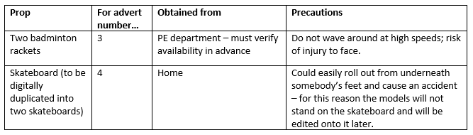
Props list
While not many props were required in the production of my adverts, I felt it was still worth preparing a props list to coordinate them, especially so that I could always be reminded of how I planned to shoot the skateboard (without the models riding it, then photograph them in the same position and superimpose them later). I was not able to work on the project for the majority of the February half-term so this documentation was useful for remembering my plans in detail when I began production the following week.
Logo design
I designed the logo before beginning the adverts so that I would be able to create an advert layout that accomodated it effectively. The logo contributes to a Wave's memorable branding: the colour used is a striking blue that will be visible and recognisable. The name 'Wave' is represented by a wavy line that separates the logo from its tagline, 'Catch the wave'. 'Catch the wave' is here used in the sense of 'join the trend', suggesting that Wave is a popular product. It also has connotations of activity - for example, catching waves is a surfing phrase, as well as to physically catch an object as one might do in several sports - again, all going back to Wave's brand identity and active, youthful audience.
 |
| The 'Wave' logo and tagline. |
Friday, 9 February 2018
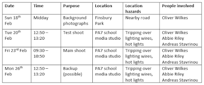
9. The practicalities of photographing: when and where production will take place and who with.
As my backgrounds will be photographed separately from the models, I have allocated the weekend of February 17th/18th to photograph backgrounds at Finsbury Park. The photographs of the models will be taken in the school media studio on Tuesday 20th and Friday 23rd of February. I have made the following table to organise this information:

Sunday, 4 February 2018
8. The planning I intend to complete in order to ensure a successful outcome for my production
The creation of a successful advert will rely on pre-production planning in order to minimise complications during the shoot itself.
Here is a list of planning material that I plan to develop prior to production:
Here is a list of planning material that I plan to develop prior to production:
- Risk assessment
Assessing risks will be important for keeping everybody involved safe during the shoot, as well as preventing damage to any equipment or public property. As such, a risk assessment is incorporated into documents such as the shoot schedule and props list in order to determine the hazards and how they can be avoided.
- Shoot schedule - 8th February 2018
The shoot schedule will detail the days on which filming takes place and the people required for each session. I will of course be taking part in every session, and any actors that appear in my adverts will also be included on their respective days. They will be shown the shoot schedule in advance to confirm that they are available at the planned times, and if not, plans can be changed ahead of time.
- Props list - 9th February 2018
A props list will document any props used in the adverts, and where they will be obtained from - as well as any potential risks associated with their use.
- Shot list - 9th February 2018
A shot list will be instrumental in keeping track of what still needs to be shot, and which advert each shot will be used in.
- Location report and photos - 17th & 18th February 2018
A location report table that includes every location will identify what each location is specifically for and include a photograph for visual identification. It will also identify any potential issues with the location in advance in order to minimise disturbance on the day itself.
- Branding design - 19th February 2018
The logo for 'Wave' will be very important in the branding of the product and will need to be present in all four adverts. Designing this in advance of advert composition will allow it to be better integrated into the adverts' layout and design.
Friday, 2 February 2018
Subscribe to:
Posts (Atom)