Here, I have listed planning completed prior to production of my adverts.
Shoot Schedule

Location report
I created a location report to identify potential problems with the background locations in advance, therefore minimising disruption on the actual day of taking photographs. I think this worked well in terms of streamlining the process. Going there beforehand has also allowed me to refine my ideas - for example, according to Google Maps' image of the area, which was 2 years out of date, there were two bollards on a path. I had considered using them as a frame within a frame, however actually visiting the location I saw that one of them has been removed, meaning I had to adapt my ideas for that advert to overcome the problem.

Shot list
I also made a shot list to break down the required shots even further, so that I could keep track of which of the 10 necessary photographs had been taken.

The shots were not taken in the adverts' numerical order. This is commonplace in the industry as it allows the crew to work according to when resources are available and be more time efficient. For example, once I had taken the photographs with the models on the 'skateboard' (in reality a stack of books for health and safety reasons), I did not require them to stay, as I had to take photographs of the skateboard on its own so that the shots could be digitally combined later. As a result, I scheduled 'advert 4' last to allow the models to leave as soon as their part was over.
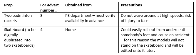
Props list
While not many props were required in the production of my adverts, I felt it was still worth preparing a props list to coordinate them, especially so that I could always be reminded of how I planned to shoot the skateboard (without the models riding it, then photograph them in the same position and superimpose them later). I was not able to work on the project for the majority of the February half-term so this documentation was useful for remembering my plans in detail when I began production the following week.
Logo design
I designed the logo before beginning the adverts so that I would be able to create an advert layout that accomodated it effectively. The logo contributes to a Wave's memorable branding: the colour used is a striking blue that will be visible and recognisable. The name 'Wave' is represented by a wavy line that separates the logo from its tagline, 'Catch the wave'. 'Catch the wave' is here used in the sense of 'join the trend', suggesting that Wave is a popular product. It also has connotations of activity - for example, catching waves is a surfing phrase, as well as to physically catch an object as one might do in several sports - again, all going back to Wave's brand identity and active, youthful audience.
 |
| The 'Wave' logo and tagline. |
No comments:
Post a Comment